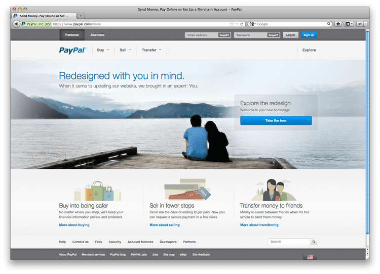
In case you haven’t already seen it, Paypal has recently emerged with a sleek, new design; and this version has earned way more points from us, right of the bat. Focusing on a user-friendly experience, Paypal has been split up for both Personal and Business Account holders, which creates a crystal-clear organizational system. It’s then broken down even further, focusing on the three main products for each type of account holder, ‘Buy, Sell, and Transfer,’ for the personal users, and ‘Sell, Grow and Fundraise,’ for the business account holders.

Now there is always the concern when a site is redesigned, whether the audience can easily navigate the new site to find what they are looking for. Paypal has nipped that problem in the bud by providing a Tour Button, an easy way to solve any initial problems you may have. The button opens a hover screen with large blue circles that direct you to each element along with a detailed description of that element.
Another great quality that the new site has embraced are the geometric illustrations that they use to visually convey their messages. They are developed in warm, calming earth tones that make the users feel more welcome and gives the site a more ‘hipster’ look. The illustrations also make the site more open, since they have, in part, replaced the boxy ads that once appeared there.
Now I have also noticed that there is a big difference in appearance between the Personal and Business pages, so the developers were really focused on their specific audience members. For personal users the site appears more welcoming, with the visual emphasis on the large relaxing photo in the center of the screen and three of the small geometric illustrations below. Once you switch over to the business end of the site, you can automatically sense the commercialism that they are going after, completely nixing the illustrations and showing isolated products as the main focus. So the new Paypal has emerged, giving recognition to their customers as the key to their success. Now this is one website that DIF Design wouldn’t mind having their name at the bottom of.

